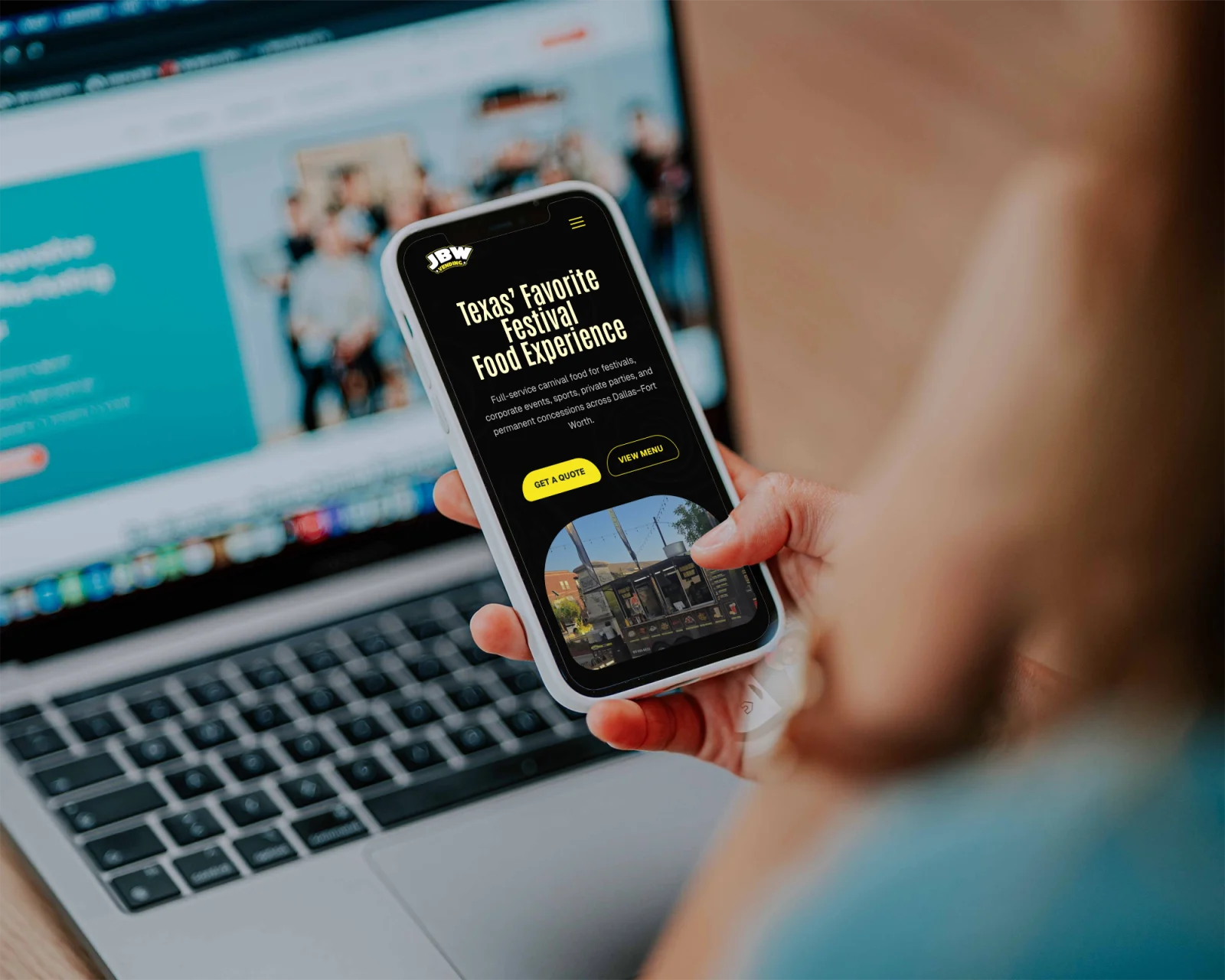
A marketing site for JBW Vending, a festival and event food company. I designed it in Figma, then built the whole page with AI: production HTML, CSS, and JavaScript, from the hero down to the booking form, with scroll-driven motion the whole way.
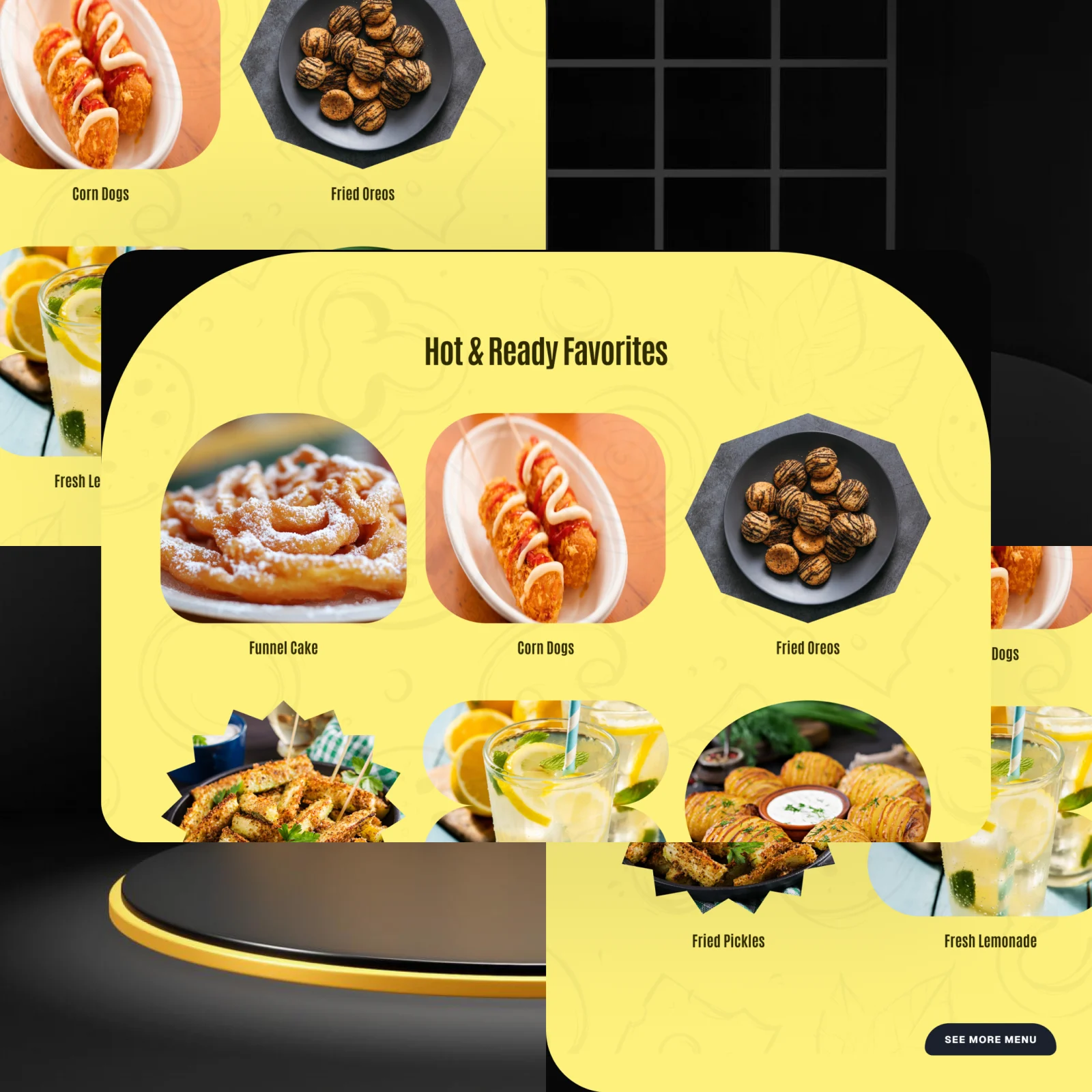
JBW Vending runs food at festivals, fairs, and private events. The site is where organisers meet the brand, browse the menu, and request a booking, so it had to feel as loud and fun as the events themselves.
I designed the page in Figma, then built the whole thing with AI, prompting my way from that design to production HTML, CSS, and JavaScript. The brief I set myself was simple: keep every bit of the design's energy, make it move on scroll, and lead people straight to the booking form.
Read the Figma design closely, from the dark carnival palette to the electric-yellow accents, so the build matched the intent piece for piece.
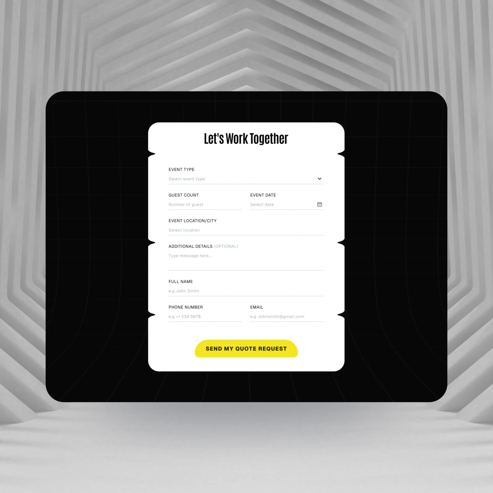
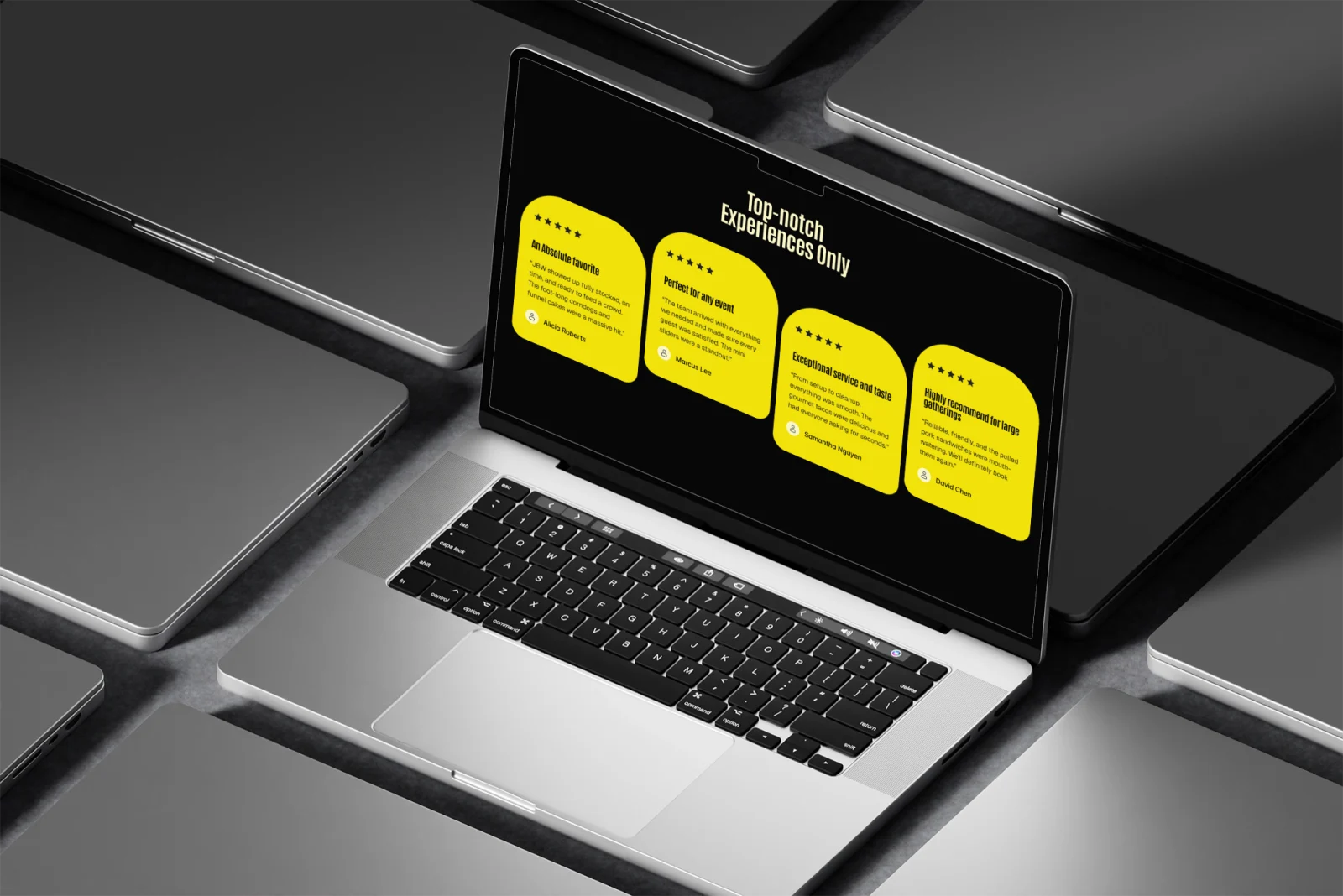
Mapped the page top to bottom: hero, metrics, events, menu, how it works, gallery, testimonials, locations, and the booking form at the end.
Built it with AI, turning the Figma design into plain HTML, CSS, and JavaScript, no frameworks, with Antonio, Geist, and Inter doing the type work.
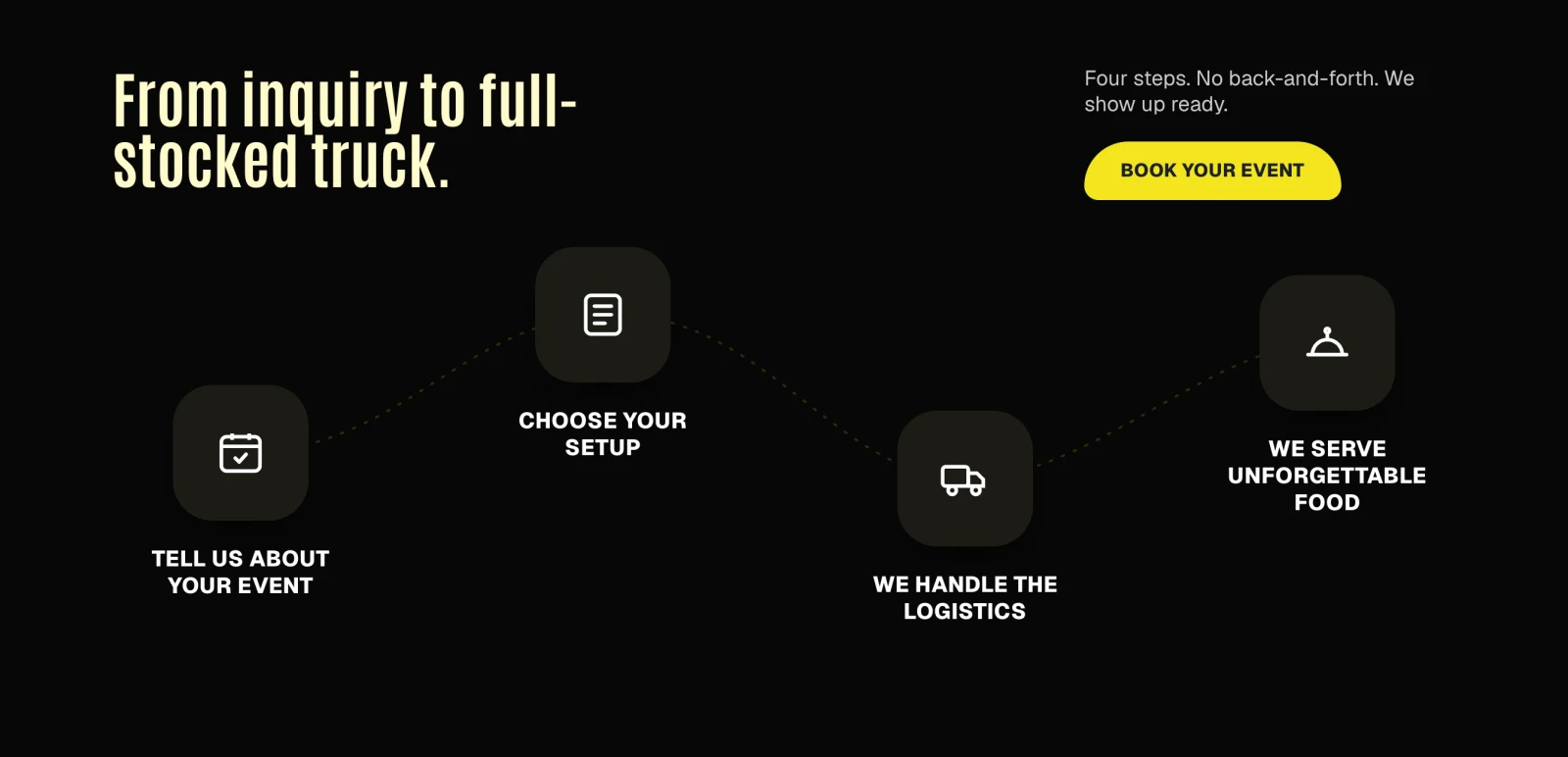
Layered in scroll interactions: section reveals, a line that draws through the how-it-works steps, and hover states across the cards and menu.
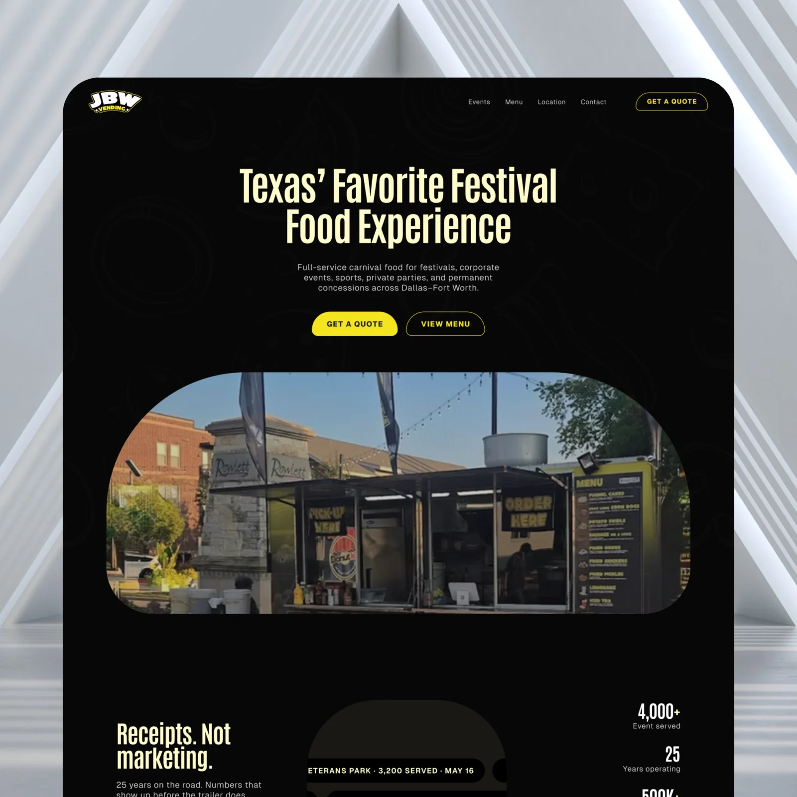
Rather than let the AI reinterpret the Figma, I pushed it to follow the design faithfully: the same dark base, yellow accents, rounded hero, and type scale, so the live page reads as the real thing.
The how-it-works section draws a yellow line through four steps as you scroll, each icon lighting up in turn, so the process explains itself without a wall of text.
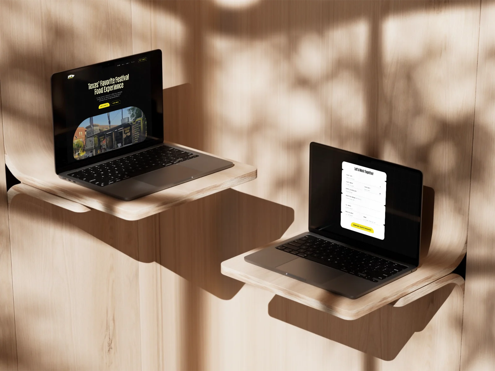
Every section leads toward the same end: the booking form. Menus, proof, and locations all set up the moment someone requests a date.
Organisers browse on the go, so the whole page collapses cleanly to mobile: the nav into a drawer, the gallery into a tidy grid, nothing clipped or off-centre.
Before the page came the basics: one electric-yellow accent on a near-black base, a warm cream for the big type, and a two-typeface system, just enough to keep every screen unmistakably JBW.

The brief was simple: keep the design's energy, make it move, and send people to the booking form. On building the JBW Vending site with AI
Liked what you saw? I'm open to full-time roles and select freelance work.
Send a note and I'll reply within 24 hours.