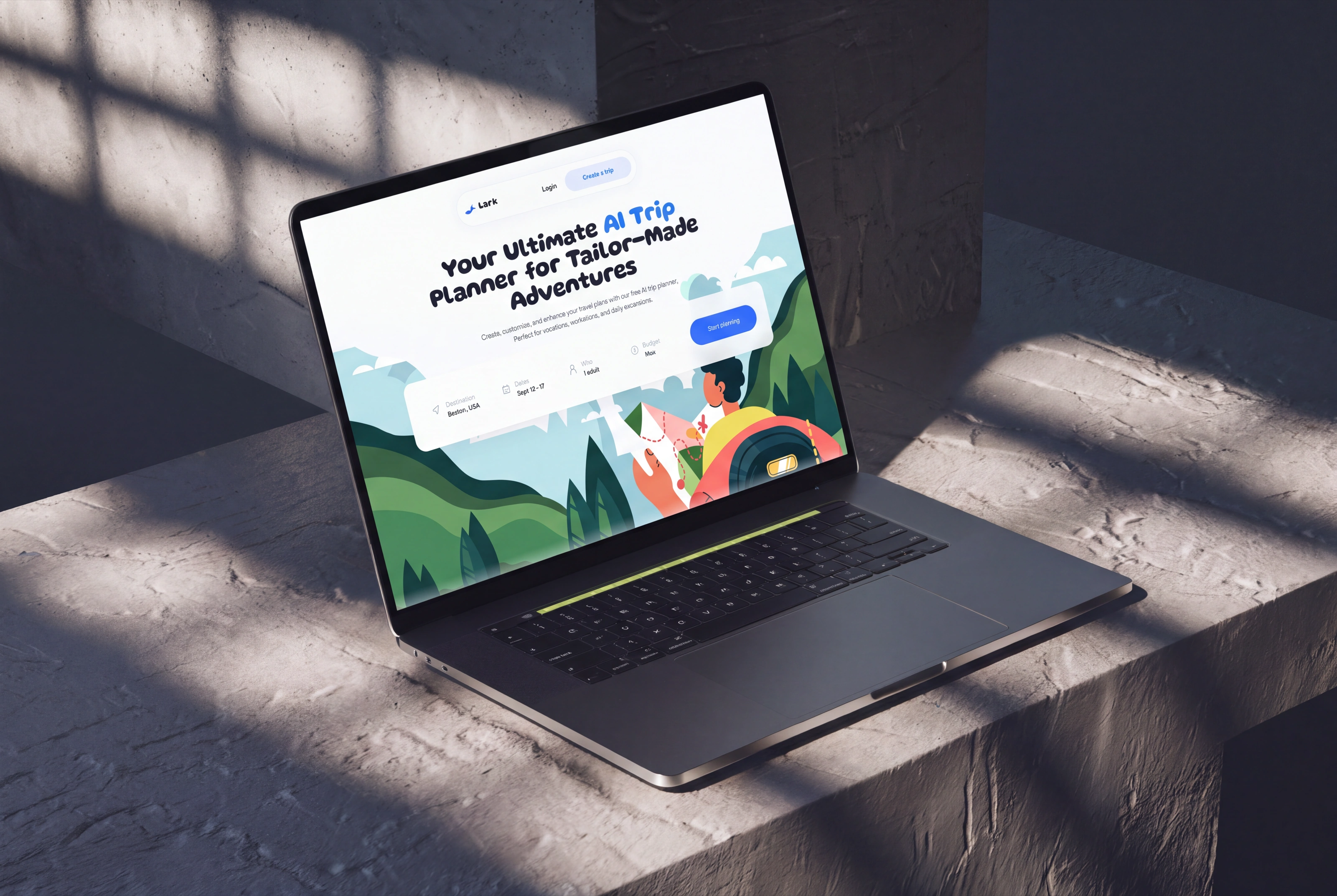
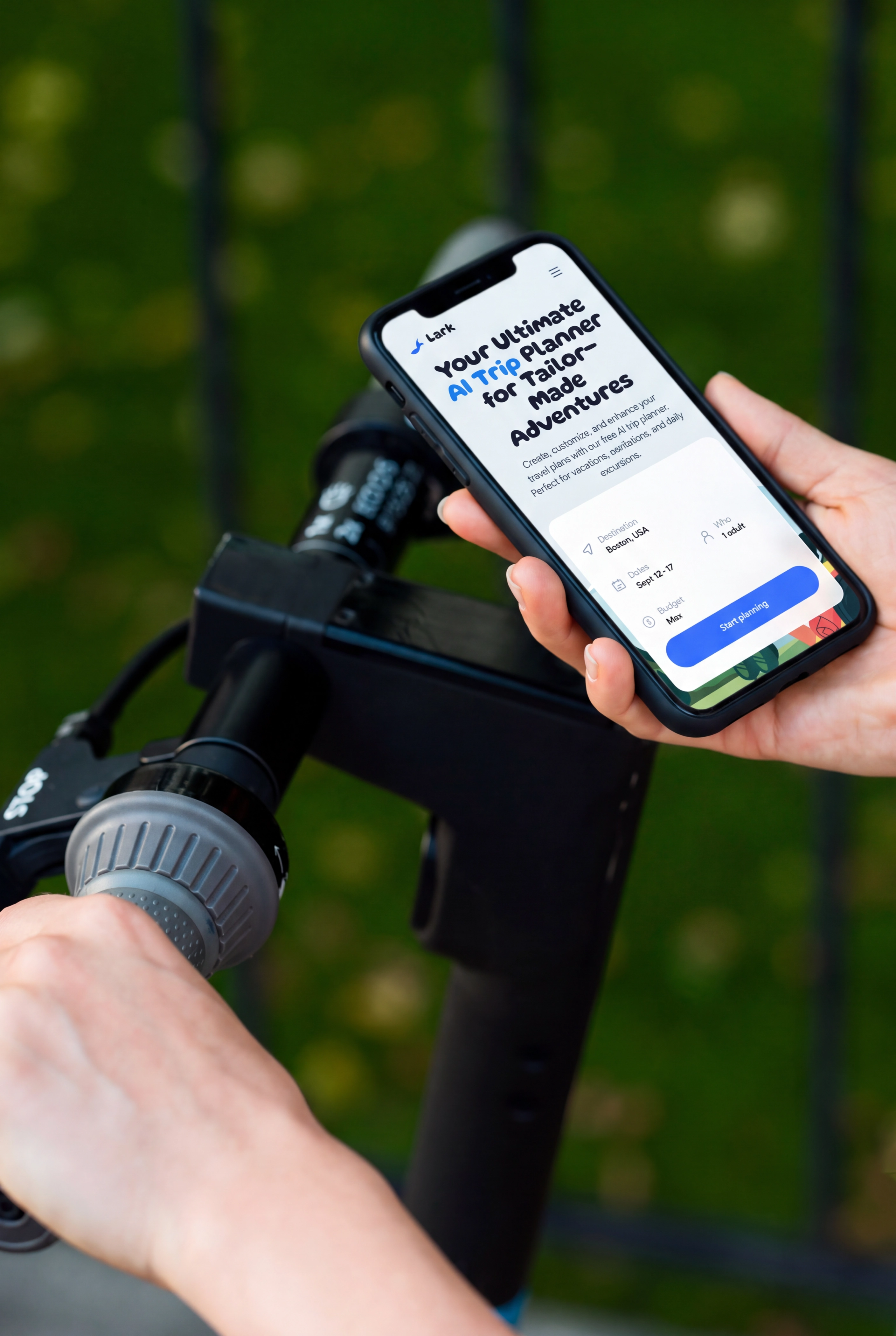
Lark is an AI trip-planner: pick a place, set your budget and pace, and it builds a mapped, day-by-day itinerary. I took a Figma product design and built the whole thing with AI, a full multi-page flow in production HTML, CSS, and JavaScript, from the first search to the finished trip.
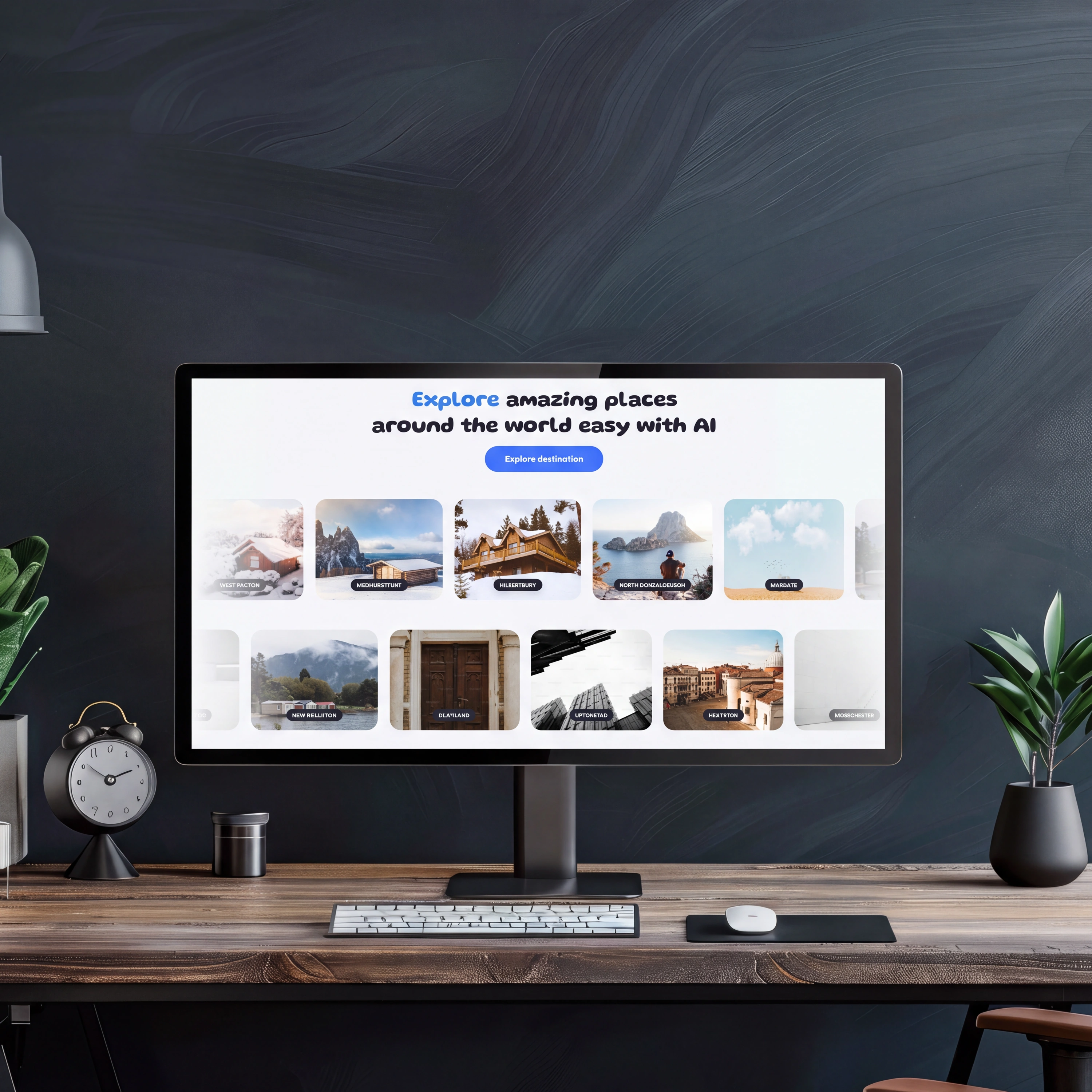
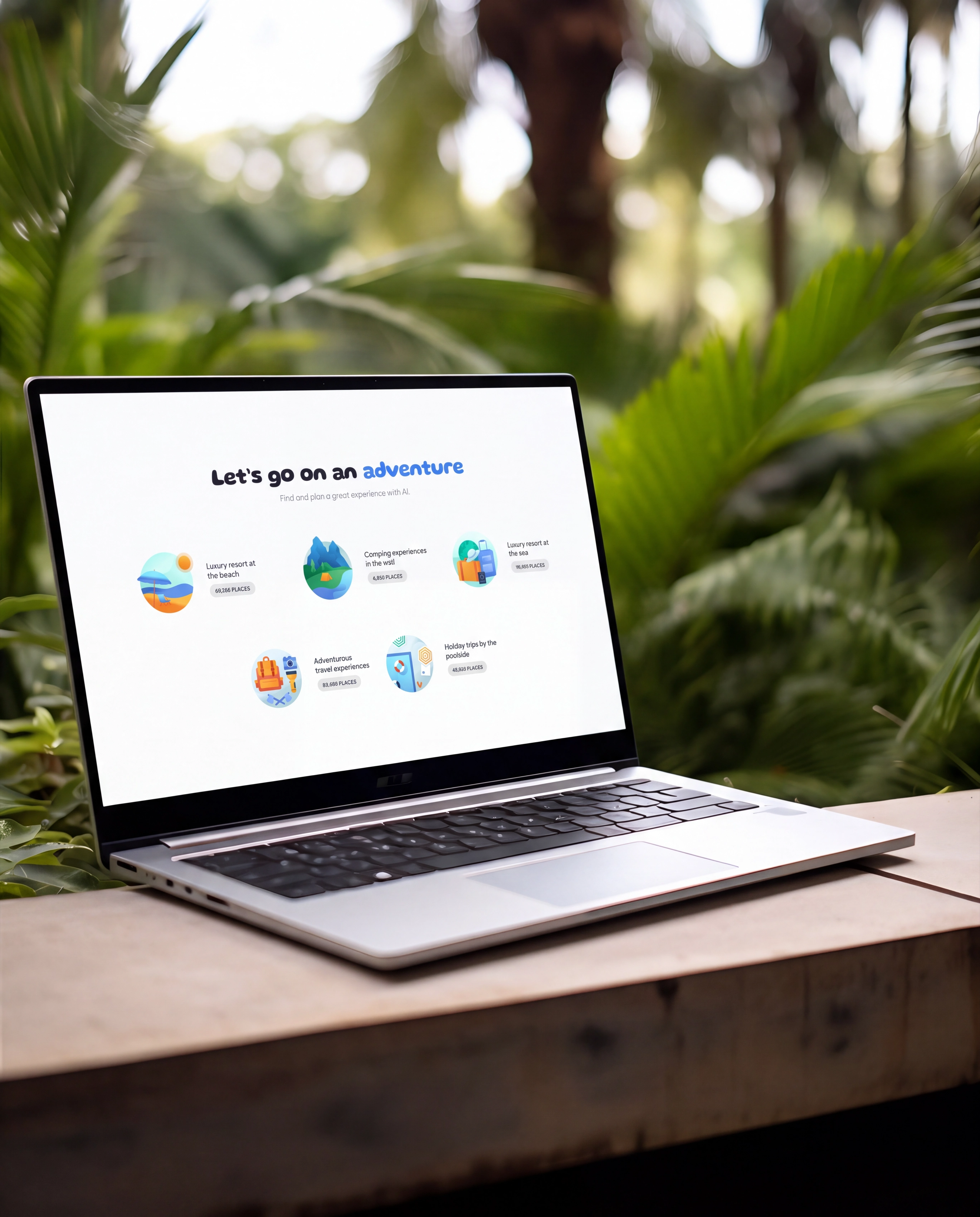
Lark takes a destination, your dates, group and budget, then generates a full trip: recommended places, a plan form, and a day-by-day itinerary you can edit, save, and share. It is a real product, not a single screen.
I started from a Figma product design and built the entire thing with AI, prompting my way from that design to production HTML, CSS, and JavaScript, no frameworks. The brief I set myself: match the design exactly, make the whole multi-page flow real, and keep every interaction feeling native.
Read the Figma design closely, the blue accent, rounded shapes, and playful type, so every screen matched the intent piece for piece.
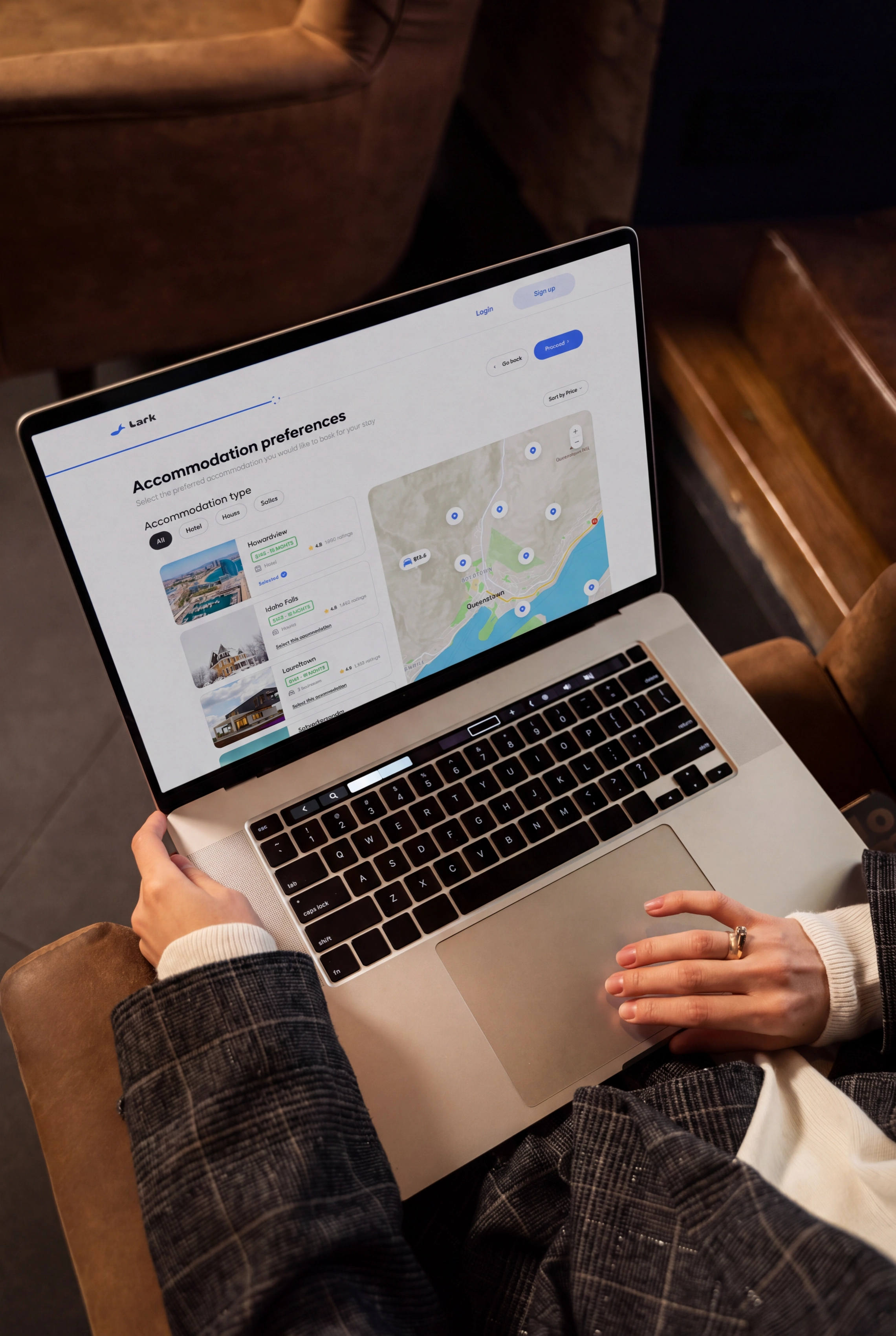
Mapped the whole journey: search, recommended trips, a destination overview, the plan form, a five-step wizard, a loader, then the itinerary and a saved-trips dashboard.
Built it with AI, turning the Figma into plain HTML, CSS, and JavaScript, no frameworks, with Gluten and Plus Jakarta Sans doing the type work.
Layered in the product feel: drag-to-move activities, mobile bottom sheets, pan-and-zoom maps, image carousels, and an animated itinerary loader.
Rather than let the AI reinterpret the Figma, I held it to the design piece for piece: the same blue, layouts, type, and spacing. Only the brand changed, from the source concept to Lark, so the live product reads as the real thing.
The whole journey works: search to recommendations, a destination overview, the plan form, a five-step wizard, a loader, then a mapped itinerary. Creating a trip gates behind sign-in, and saved trips land in a dashboard.
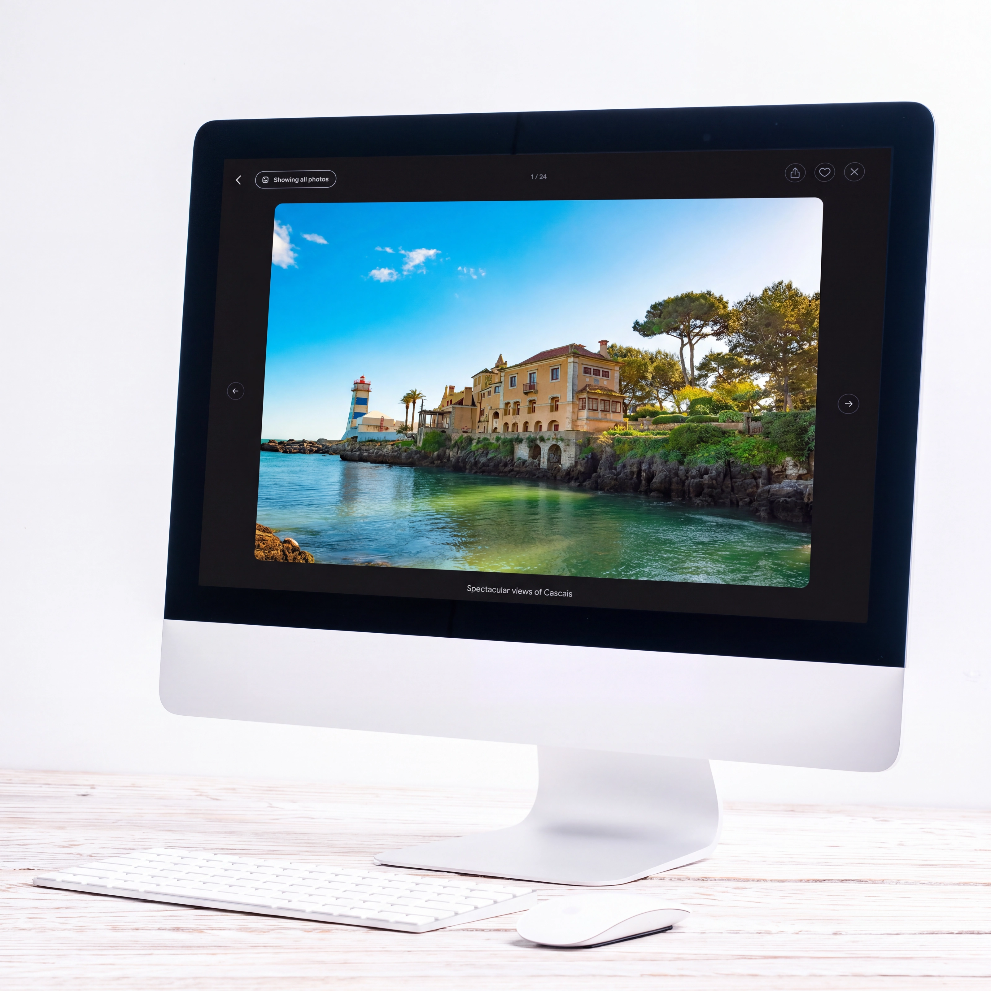
Activities drag between days and times of day, selectors open as bottom sheets on mobile, maps pan and zoom, carousels swipe, and an animated loader assembles the itinerary. Little things, but they make it feel like a product.
The desktop experience is complete; the phone view ships behind a playful "under construction" gate, with a peek link to the real thing, so the story stays truthful rather than over-promising.
One confident blue on soft, airy neutrals, a rounded marker display for the big type, and a clean sans for the interface, just enough to keep every screen unmistakably Lark.
The rule was simple: match the Figma exactly, make the whole flow real, and keep every interaction feeling native. On building Lark with AI
Liked what you saw? I'm open to full-time roles and select freelance work.
Send a note and I'll reply within 24 hours.