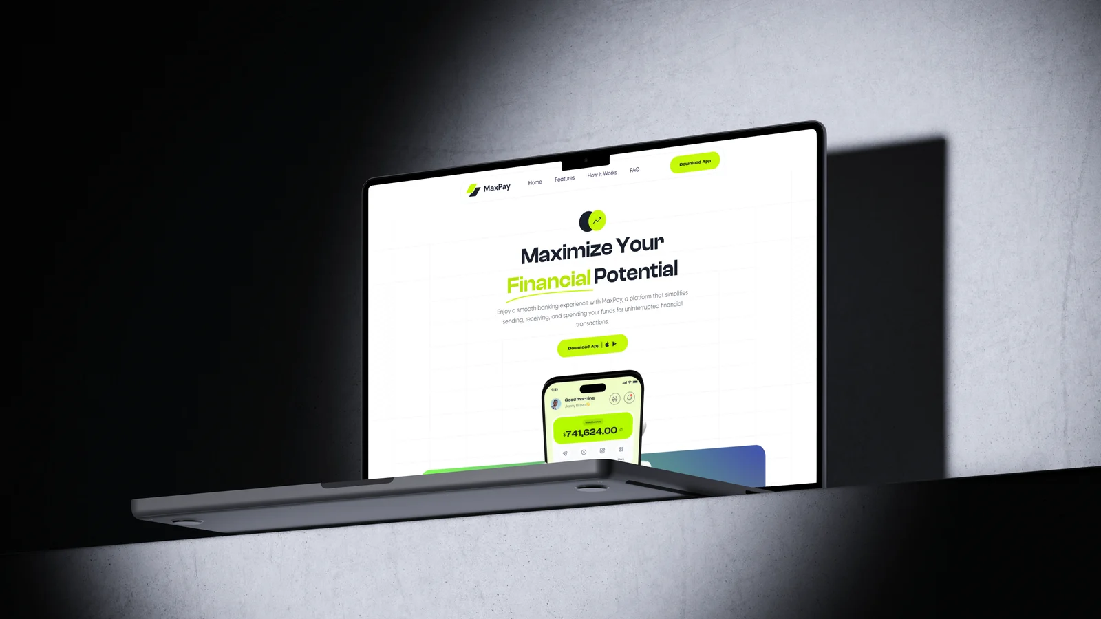
A marketing landing page for MaxPay, a modern fintech app. Designed and built end to end in Framer, introducing the product, walking through its features, and pointing everything toward one action: download the app.
MaxPay is a fintech product for sending, receiving, and spending money from a single wallet. The landing page is its front door, the first thing a potential user meets before the app store.
I designed and built the whole page in Framer, from layout and type to the motion between sections. The brief I set myself was simple: explain a money app quickly, make it feel trustworthy, and get people to the download button.
Studied fintech and app landing pages to see how the best ones earn trust fast and hold to a single, obvious next step.
Mapped a top-to-bottom story: hero and app shot, security, global payments, how it works, FAQ, each section setting up the download.
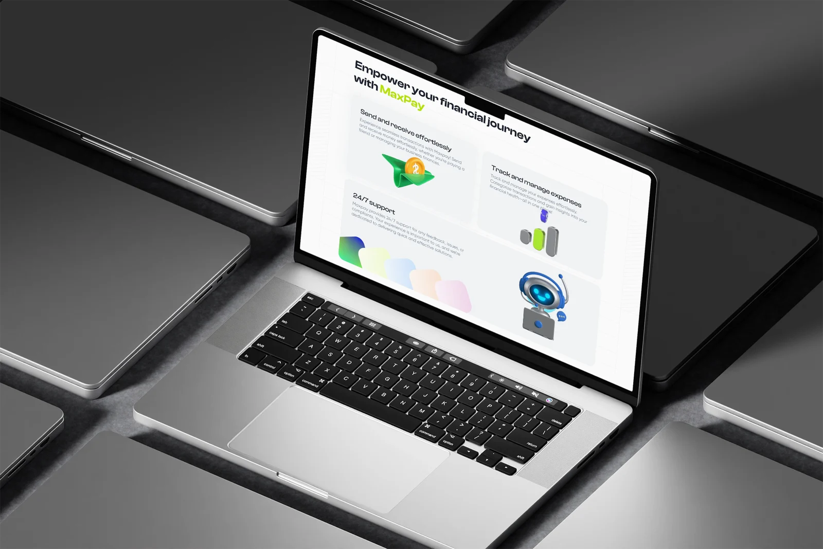
Designed and built directly in Framer with a lime-on-light system, real app mockups, and 3D props to keep it energetic but clear.
Layered in scroll and entrance animation so the page feels alive on the way down, without getting in the way of reading.
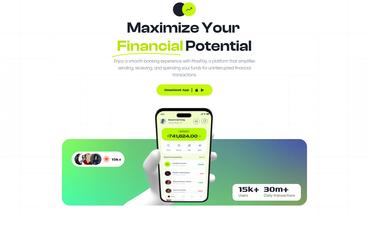
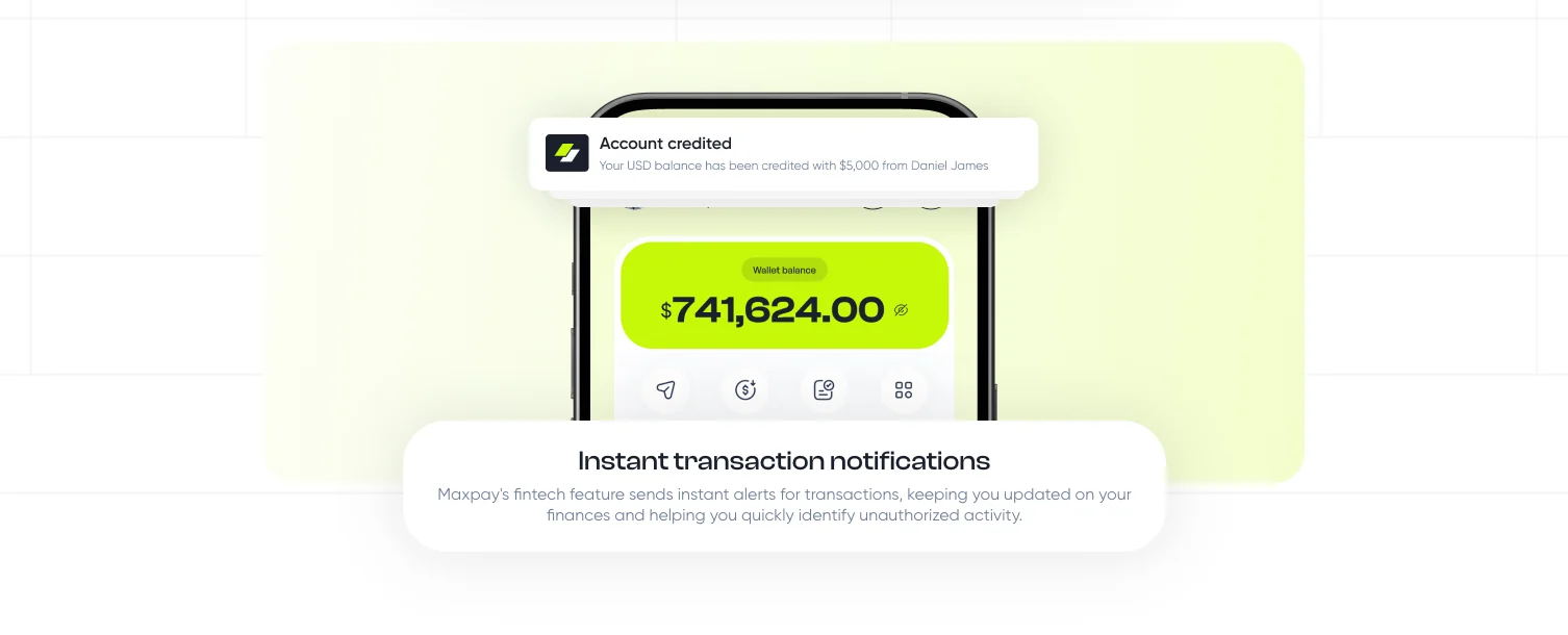
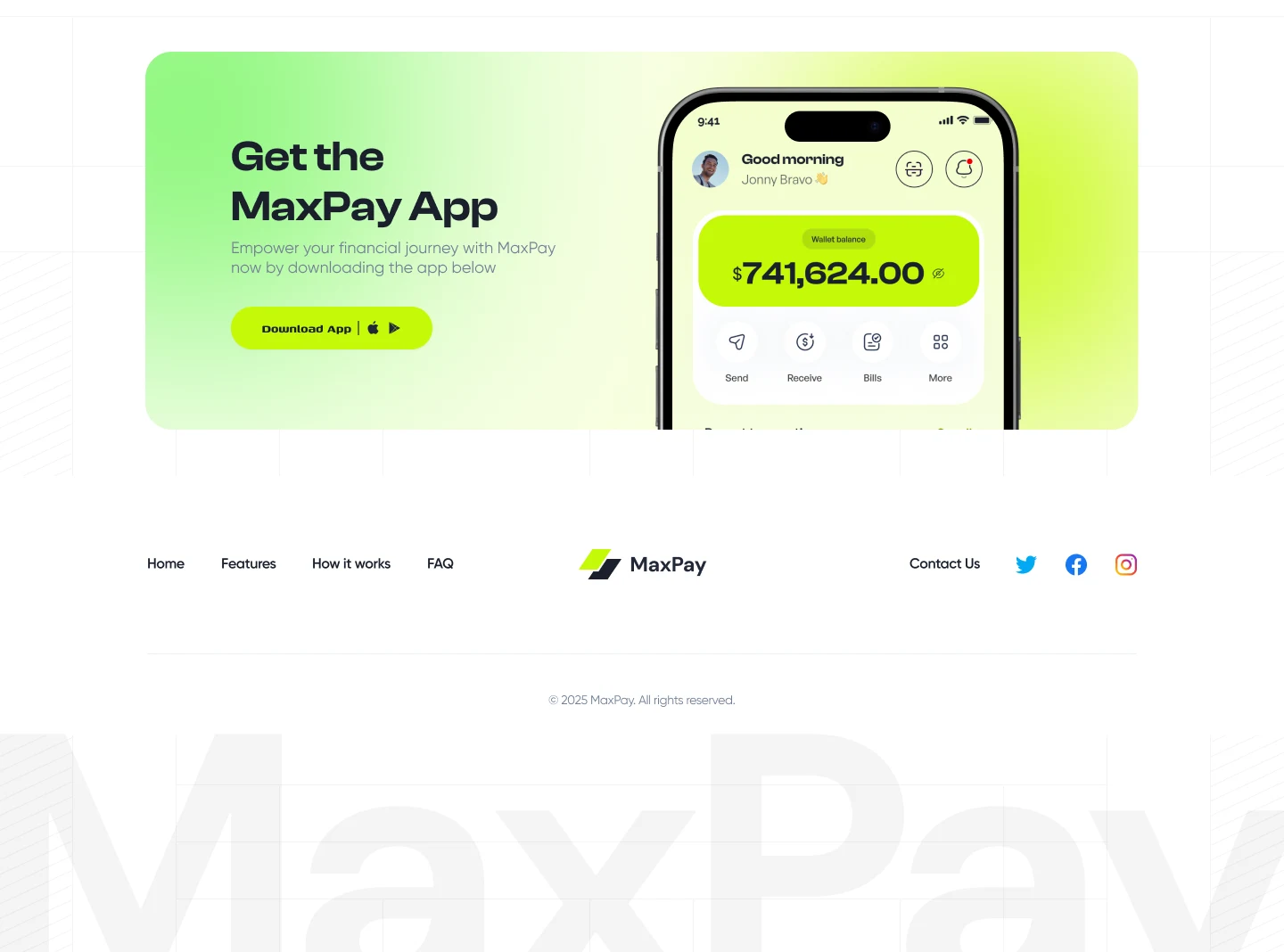
The product shows up immediately: a real phone mockup with a live wallet balance, so visitors see what they're downloading before they read a single line.
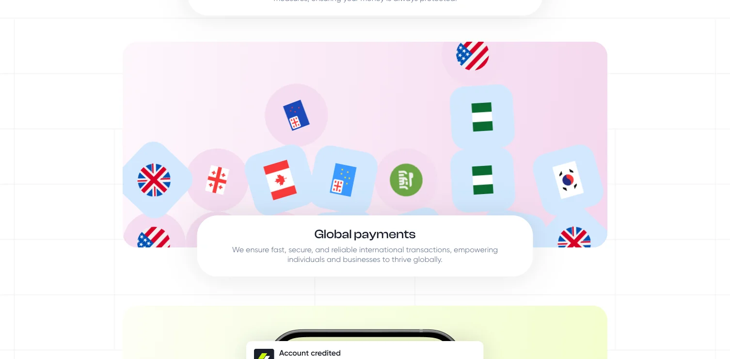
Security, global payments, instant alerts, each gets its own moment instead of a cramped feature grid, so nothing competes for attention.
Every section points back to the same call to action, Download App. No competing buttons, no dead ends, no second-guessing.
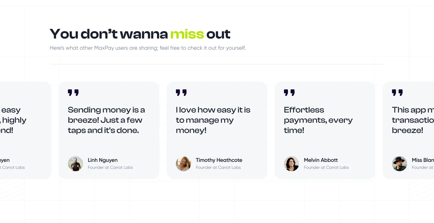
A bold lime-and-black system keeps it modern, while flags, security copy, and real numbers do the quiet work of building confidence in a money product.
Before the page came the basics: one electric-lime accent against a near-black ink, a two-typeface system, and a single confident mark. Just enough to keep every screen unmistakably MaxPay.
A landing page has one job: turn a curious visitor into a download. On building MaxPay in Framer
Liked what you saw? I'm open to full-time roles and select freelance work.
Send a note and I'll reply within 24 hours.